Colour Seasons Analysis: How to Find Your Colour Season
Colour seasons are a way of grouping specific color palettes based on how they interact with a person’s natural coloring (skin undertone, eyes, and hair). The system uses the four natural seasons—Spring, Summer, Autumn, and Winter—as visual metaphors to categorize these palettes.
Instead of just looking at what colors you “like,” it analyzes how the three dimensions of color interact with your features.
The Three Dimensions of Color Analysis
To understand the seasons, you have to look at the three traits that define every single color:
- Undertone (Hue): Is the color Warm (yellow/golden base) or Cool (blue/pink base)?
- Value (Depth): Is the color Light (more white added) or Deep/Dark (more black added)?
- Chroma (Clarity): Is the color Bright/Clear (pure, highly saturated) or Muted/Soft (toned down with gray/brown)?
The Four Main Seasons
The classic four-season system divides people into basic categories based on undertone and value.
1. Spring (Warm & Light)
Spring colors mimic a fresh blossoming garden. They are warm, bright, and radiant. People who fit this season usually have a clear, golden undertone to their skin, light-colored eyes, and warm blond, golden brown, or strawberry blond hair.
- Key colors: Coral, peach, warm turquoise, daffodil yellow, camel.
2. Summer (Cool & Light)
Summer colors look like a hazy, sun-bleached beach day. They are cool, soft, and gentle. Features typically have a muted quality—think cool ash hair (blond or brown), soft blue, gray, or green eyes, and skin with a distinct pink or blue undertone.
- Key colors: Lavender, powder blue, soft rose, slate gray, sage green.
3. Autumn (Warm & Deep)
Autumn colors mirror changing leaves, earth, and spices. They are warm, rich, and heavily muted. Features generally have low contrast but rich depth, featuring golden-warm skin, rich brown, olive, or hazel eyes, and auburn, copper, or deep chestnut hair.
- Key colors: Terracotta, olive green, mustard yellow, burnt orange, espresso.
4. Winter (Cool & Deep)
Winter colors are sharp, vivid, and icy—like a snowy landscape against a dark night sky. They are cool, bright, and highly saturated. Features usually have high contrast, such as striking dark hair against bright skin, or vivid, piercing eyes (clear blue, dark brown, bright hazel).
- Key colors: Royal blue, emerald green, ruby red, stark white, and true black.
This interactive tool has been created to Help you gain a better understanding of these three metrics and how they interact.
Seasonal Matrix Analyzer
The Expanded 12-Season System
Because very few people fit perfectly into just one of four buckets, modern color analysis expands this into 12 seasons (and sometimes 16, as seen in the chart above). This expansion adds a “dominant trait” to each main season, creating sub-seasons that sit on the boundary between two main ones.
| Dominant Trait | Sub-Seasons | Description |
| Light (Low Depth) | Light Spring / Light Summer | Lightness is the most obvious trait. Soft, pastel-leaning palettes. |
| Deep (High Depth) | Deep Autumn / Deep Winter | Richness and depth dominate. Dark, intense palettes. |
| Warm (Pure Gold) | True Spring / True Autumn | Absolutely zero cool blue undertones. Purely golden and rich. |
| Cool (Pure Blue) | True Summer / True Winter | Absolutely zero warm golden undertones. Purely icy or berries. |
| Clear / Bright (High Saturation) | Bright Spring / Bright Winter | Striking, vibrant colors. Muddy or grayed-out tones completely wash them out. |
| Muted / Soft (Low Saturation) | Soft Summer / Soft Autumn | Desaturated, gray- or brown-toned colors. High vibrancy overpowers them. |
Why it matters: Wearing colors that match your seasonal palette minimizes imperfections, brightens the complexion, and makes your eyes pop, whereas the wrong season can make you look tired, sallow, or completely washed out.
Want to figure out your own undertone using simple home tests?
Finding your undertone at home is all about looking at how your skin reacts to different light, colors, and metals. The goal is to see whether your skin naturally carries a cool (blue/pink), warm (yellow/golden), or neutral (a balance of both) base.
To get the most accurate results, make sure you are doing these tests in indirect, natural daylight (like standing near a window) and with a completely clean face.
Here are five classic tests you can run right now. You can enter your answers at the bottom to find your results.
1. The Wrist Vein Test
Look at the veins on the inside of your wrist. Since skin acts as a translucent filter over your blood vessels, the color that shows through is a major indicator of your undertone.
- Cool: Your veins look distinctly blue or purple.
- Warm: Your veins look greenish or olive (because blue veins viewed through yellow-toned skin appear green).
- Neutral: You can’t quite tell—they might look blue-green, teal, or match your skin color entirely.
2. The Pure White vs. Cream Test
Grab two pieces of fabric or clothing: one that is stark, optical pure white and one that is an off-white, cream, or ivory tone. Hold them up to your bare face in good lighting.
- Cool: Stark white makes your skin look vibrant and glowing, while cream makes you look slightly washed out or yellowed.
- Warm: Cream or ivory compliments your skin beautifully, while stark white makes you look drained, sallow, or “ghost-like.”
- Neutral: You look great in both without feeling washed out by either.
3. The Gold vs. Silver Jewelry Test
This isn’t about which metal you prefer to wear, but rather which one makes your skin look healthier and more even. Put a piece of shiny silver jewelry on one hand/wrist and a piece of yellow gold on the other.
- Cool: Silver makes your skin look bright and clear. Gold might look heavy or clash with your skin.
- Warm: Gold melts into your skin and gives you a healthy glow. Silver can look cold or dull against you.
- Neutral: Both look equally flattering, and neither metal noticeably clashes with your skin tone.
4. The White Paper Test
Hold a plain, stark white sheet of computer paper up next to your neck and chest in the mirror. Look at how your skin appears in comparison to the pure white background.
- Cool: Your skin will look distinctly pink, rosy, or blue-red against the paper.
- Warm: Your skin will look yellow, golden, peach, or warm brown.
- Neutral: Your skin might look a bit grey, slightly green (olive), or you won’t notice a strong lean toward either pink or yellow.
5. The Sun Reaction Test
Think about how your skin behaves when you spend time in the sun (always assuming you’re wearing SPF, of course!).
- Cool: You burn easily, turn pink or red first, and struggle to tan.
- Warm: You tan easily and rarely burn, turning a golden-brown shade.
- Neutral: You might burn slightly at first but then turn into a tan, or you tan moderately without a strong golden or reddish hue.
Tallying Your Results
Look at your answers across all five tests to find your pattern:
| Mostly Cool | Mostly Warm | Balanced / Mixed |
| You have a Cool undertone. Look closer at the Winter and Summer palettes. | You have a Warm undertone. Look closer at the Autumn and Spring palettes. | You have a Neutral undertone. You likely sit on a seasonal boundary (like Soft Summer/Soft Autumn or Bright Winter/Bright Spring). |
A quick tip on Olive Skin: If you noticed your veins look green but the white paper test made you look slightly greenish-gray rather than bright yellow-gold, you likely have an olive undertone. Olive is technically a cool/neutral variation of undertone, but because it has yellow surface tones, it often aligns beautifully with muted or deep palettes like Autumn or Soft Summer.
Contrast
Contrast is the final piece of the color analysis puzzle. While your undertone tells you which colors to wear (warm vs. cool), your contrast level tells you how to style them—specifically, how light or dark your pieces should be when paired together.
In simple terms, contrast is the difference in value (lightness vs. darkness) between your features—your skin, hair, and eyes.
How to Determine Your Contrast Level
The easiest way to measure this at home is the Black-and-White Photo Test.
Step 1: Take a raw, unfiltered selfie
Stand in natural, indirect daylight. Avoid bright makeup; your natural features need to be the focus.
Step 2: Convert the photo to black and white
Turn down the saturation completely. Do not use a stylized filter; just use a standard grayscale conversion.
Step 3: Evaluate the value differences
Look at your face as a grayscale gradient. Where do you fall on the scale below?
- High Contrast: Your hair and eyes are very dark (near black), while your skin is very light (near white). Or, less commonly, your skin is very deep and your hair/eyes are incredibly light. There is a dramatic, sharp difference between the lightest and darkest parts of your face.
- Medium Contrast: There is a noticeable step between your features, but it’s not jarring. For example, you might have medium-brown hair, hazel eyes, and light-to-medium skin. You have a mix of light, medium, and dark values.
- Low Contrast: All your features sit at a similar depth on the grayscale.
- Low/Light: Everything is light (blonde hair, pale skin, light blue eyes).
- Low/Muted: Everything sits in the medium range (ash-brown hair, grey-green eyes, medium skin).
- Low/Deep: Everything is deep (dark skin, dark brown hair, dark eyes).
Why Contrast Matters for Your Palette
Matching the contrast level of your clothes to the natural contrast of your face ensures your outfit complements you rather than competing with you.
Your Face: [High Contrast]  ---> Wear: [High Contrast Outfits] (e.g., Black + White)
Your Face: [Low Contrast]   ---> Wear: [Monochromatic / Tonal Outfits] (e.g., Beige + Cream)
If you wear a high-contrast outfit but have low-contrast features, the clothes will completely swallow you up—people will see the outfit long before they see your face. Conversely, if a high-contrast person wears a low-contrast, monochromatic outfit, they can look washed out or like a “floating head.”
How Contrast Defines the Seasonal Palettes
Contrast is the hidden engine behind the 12 sub-seasons. It often acts as the deciding factor when choosing between two similar palettes.
1. High Contrast = Winter & Spring
These seasons thrive on sharpness and clarity.
- Winter (High Contrast): Classic Winter is high contrast (think dark hair against porcelain skin). They look incredible in sharp, opposing values like true black paired with stark white, or royal blue paired with an icy pastel.
- Bright Spring (High/Medium Contrast): Features are incredibly vivid. They handle high-contrast pairings beautifully, usually done with a dark neutral and a strikingly bright pop color (like deep navy paired with bright coral).
2. Medium Contrast = Autumn & Bright Summer
These seasons need balance—enough variation to avoid looking flat, but not so sharp that it looks harsh.
- True Autumn: Often features a rich mix of medium-to-dark auburn or chestnut hair against golden, medium skin. They look best in rich combos like forest green paired with camel.
- True Summer / Light Spring: Medium contrast elements where light colors are grounded by a medium-depth neutral (like soft slate gray paired with lavender).
3. Low Contrast = Summer & Soft Autumn
These seasons look best in blended, tonal, or monochromatic combinations.
- Soft Summer / Soft Autumn (Muted Low): Features blend together seamlessly (e.g., mousey ash-brown hair, soft grey eyes, and muted skin). High contrast overwhelms them. They shine in “tonal” dressing—wearing different shades of the same color family or pairing colors of the exact same depth (like sage green with soft terracotta).
- Light Summer / Light Spring (Light Low): All features are airy and light. They look best in all-pastel or light-neutral outfits (like cream paired with soft peach).
To find your exact match among the 12 sub-seasons, you have to look for your primary dominant characteristic.
When you look in the mirror, what is the very first thing you notice about your coloring? Is it exceptionally bright? Deep? Light? Cool? Warm? Or Muted? Once you identify that number-one trait, you instantly narrow your choices down to just two sister sub-seasons.
The 12 Sub-Seasons Broken Down
The seasonal wheel flows into 6 distinct color pairs based on their most defining feature.
1. If your primary trait is DEEP (Dark)
You have high contrast, dark hair, and deep, striking eyes. Your colors need richness and weight.
- Dark Winter (Deep + Cool): You are a Winter who borders Autumn. Your skin tone can be fair or deep, but your undertone is cool. True black and icy white look incredible on you, but you can also borrow rich espresso or deep burgundy from Autumn.
- Dark Autumn (Deep + Warm): You are an Autumn who borders Winter. Your features have a distinct golden or bronze glow. You look stunning in deep terracotta, forest green, and dark chocolate brown. Black looks okay on you, but rich dark brown or olive is far more flattering.
2. If your primary trait is LIGHT
Your overall look is delicate, soft, and low-contrast. Your hair, eyes, and skin all sit on the lighter end of the spectrum. Heavy or dark colors completely weigh you down.
- Light Spring (Light + Warm): You are a Spring who borders Summer. Your coloring is bright, sunny, and clear but very fair (think strawberry blonde or golden blonde with bright teal or green eyes). Your palette is filled with warm pastels like peach, apricot, and sunny yellow.
- Light Summer (Light + Cool): You are a Summer who borders Spring. Your features are icy and delicate (think ash-blonde hair and light blue or grey eyes). Your colors are soft, cool pastels like powder blue, lavender, and soft mint green.
3. If your primary trait is WARM
You have absolutely zero cool tones in your skin, hair, or eyes. Everything about your coloring screams golden, copper, or bronze.
- True Spring (Warm + Bright): Your features are highly saturated, warm, and lively. Your hair might be bright ginger, copper, or golden brown. You look best in vibrant, tropical warm shades like bright coral, marigold, and true turquoise.
- True Autumn (Warm + Muted): Your features are rich, earthy, and grounded. Think rich auburn hair, hazel-green eyes, and warm golden skin. Your colors are spicy and rich: mustard yellow, pumpkin orange, and deep olive green.
4. If your primary trait is COOL
You have absolutely zero warm, golden, or orange tones in your coloring. Your skin has a blue, pink, or cool olive undertone, and your hair is distinctly ash-toned or blue-black.
- True Summer (Cool + Muted): You are entirely cool-toned but soft and gentle. Your contrast is medium-low. Think ash-brown hair and soft grey-blue eyes. Your perfect colors are soft raspberry, slate blue, and cool lavender.
- True Winter (Cool + Bright): You are entirely cool-toned, sharp, and vivid. Your contrast is incredibly high (think striking dark hair against clear fair skin, or deep blue-black skin with vivid white eyes). You shine in true black, royal blue, emerald green, and hot fuchsia.
5. If your primary trait is BRIGHT (Clear)
Your eyes are often your standout feature—striking, glassy, and piercing. Your overall coloring is vivid, highly saturated, and high-contrast. Muted, grayed-out colors make you look instantly exhausted.
- Bright Spring (Bright + Warm): You are a Spring who borders Winter. Your features are incredibly vibrant and sunny, with high contrast. You handle intense, fiery saturation beautifully—think bright poppy red, lime green, and vivid flamingo pink.
- Bright Winter (Bright + Cool): You are a Winter who borders Spring. Your features are ice-bright and crystal clear. You look exceptional in highly saturated, electric neon-adjacent shades like electric blue, bright magenta, and stark neon pink.
6. If your primary trait is SOFT (Muted)
Your features blend together softly with very low contrast. There is a “hazy” or grayed-out quality to your coloring, and muddy, complex tones look incredibly elegant on you. Bright neon colors completely overpower your face.
- Soft Summer (Soft + Cool): You are a Summer who borders Autumn. Your hair is often a soft ash-blonde or “mousey” light brown, and your eyes are a muted grey-blue or hazel. You look stunning in desaturated, dusty tones like dusty rose, mauve, and charcoal gray.
- Soft Autumn (Soft + Warm): You are an Autumn who borders Summer. Your features have a gentle, warm, and velvety quality. Think warm sand, khaki, sage green, and soft terracotta. You look best in colors that are warm but gently toned down with a splash of brown or gray.
How to Determine Which One You Are
To narrow down your sub-season, answer these two filtering questions:
Step 1: What stands out first? (e.g., "I am clearly very Muted/Soft")
        ↳ This narrows you down to 2 sister seasons (Soft Summer vs. Soft Autumn).

Step 2: Does gold or silver look better? (e.g., "Gold makes me glow, silver looks dull")
        ↳ Warm wins! You are a Soft Autumn.
If you are stuck between a boundary (like Dark Winter vs. Dark Autumn), look at the metals and “test colors”. Dark Winter will look incredible in true black and pure silver, while Dark Autumn will look far better in deep moss green, rich bronze, and yellow gold.
Which Palettes to Trust Once You Determine Your Colour Season
It can be incredibly frustrating when you finally figure out your sub-season, only to look at three different websites and see three completely different sets of colors for that exact same season. One site’s “Soft Autumn” might look rich and earthy, while another’s looks light and almost gray.
There are very specific, logical reasons why these discrepancies happen, and understanding them will help you know which palettes to trust.
Why the Palettes Vary Across Websites
The variation comes down to a mix of different business systems, digital display limits, and artistic choices by creators.
1. Different Color Systems and Schools of Thought
Color analysis isn’t managed by a single global governing body. Instead, different companies created their own proprietary systems over the decades:
- The Sci\ART System: Developed by Kathryn Kalisz, this system applies rigid Munsell color science (measuring hue, value, and chroma mathematically). Websites that follow Sci\ART methods tend to have very specific, scientifically calibrated palettes.
- The Color Me Beautiful System: The original 1980s commercial system, which has evolved into its own style of grouping.
- Independent Systems: Modern creators (like The Concept Wardrobe, Spicemarket Colour, or Style Me Jenn) often build their own custom digital swatches using their unique interpretation of the seasonal boundaries.
2. The Shift from Fabric to Digital Screens
Color analysis was originally designed using physical fabric drapes reflecting natural light. Translating physical dye into a digital pixel (an RGB color code) is incredibly difficult.
- A color that looks like a perfect “soft sage green” on a matte piece of linen might look bright and electric when rendered on a backlit iPhone screen.
- Creators calibrate their digital graphics differently, leading to massive visual shifts from one site to another.
3. Screen Variations (The Device Problem)
Even if every website used the exact same color code, a palette will look vastly different on an iPhone with TrueTone turned on compared to a cheap desktop monitor or a Samsung device with high-vibrancy display settings.
Which Palettes Should You Trust?
Instead of looking for the “one true accurate website,” look for consistency in color dimensions rather than exact shade matches.
The most accurate, trustworthy palettes are those that strictly respect the rules of the sub-season (its Undertone, Value, and Chroma).
How to Evaluate if a Website’s Palette is Accurate:
- Check the boundaries: If you are looking at a True/Cool Summer palette, there should be absolutely zero warm golden tones or orange-reds. If you see a warm peach or a mustard yellow in a Summer palette, that website’s palette is inaccurate.
- Check the saturation: A Soft Summer palette should look visibly grayed-out and dusty. If a website shows a “Soft Summer” palette filled with bright, clear neon-adjacent lavenders and hot pinks, the creator has missed the mark on chroma.
- Look for color science backing: Websites that explicitly explain the Munsell characteristics (Value, Chroma, Hue) of their palettes are generally much more accurate than fashion blogs that just throw together a collection of pretty aesthetics.
The Rule of Thumb for Shopping
Never try to perfectly match a garment in a store to an exact color swatch on your phone. Instead, ask yourself if the garment shares the same three traits as your season.
For example, if you are a Dark Autumn, you don’t need to find the exact RGB shade of green from your favorite website. You just need to look at the shirt in front of you and confirm: Is it dark? Is it warm? Is it slightly rich/muted? If it ticks all three boxes, it fits your palette perfectly—regardless of what a specific website says.
When you want to bypass the generic, inconsistent palettes floating around social media, you need to look to websites and professional color systems rooted in Munsell Color Theory. This branch of color science measures color mathematically across three strict axes: Hue (undertone), Value (depth), and Chroma (clarity).
The most reputable, accurate systems and digital resources for the 12-season method prioritize this scientific approach over trend-based aesthetics.
1. The Gold Standard Digital Resources (Best for Free Guides)
If you are looking for highly accurate digital swatches and educational breakdowns without a paywall, these two websites are widely considered the best in the industry.
The Concept Wardrobe
Run by an independent color analyst, this is arguably the most thorough and visually precise digital encyclopedia for the 12-season system.
- Why it’s accurate: The site builds its palettes entirely on color science boundaries. It treats the sub-seasons as a continuous spectrum (a “flow” system), explicitly mapping out which exact colors can be borrowed from sister seasons.
- Best for: Visual learners who want deep-dive structural guides on value, chroma, contrast, and comprehensive clothing palettes for every sub-season.
Gabrielle Arruda
A fashion and style analyst who provides incredibly comprehensive, free, DIY 12-season guides.
- Why it’s accurate: She bridges the gap between rigid color science and practical personal styling, ensuring her digital palettes maintain correct desaturation (for soft seasons) and pure warmth/coolness where required.
- Best for: Step-by-step self-typing guides, testing instructions, and real-world wardrobe applications.
2. The Legacy Color Systems (The Scientific Authority)
If you want to buy highly accurate physical swatches, look into professional systems that originated directly from or evolved alongside the Sci\ART system (the framework that originally perfected the 12-season Munsell method).
True Colour International (TCI)
Founded by Amelia Butler and heavily based on Sci\ART principles, TCI is one of the most respected global institutions for professional color analysis training and tools.
- Why it’s accurate: TCI’s physical and digital fabric palettes are scientifically calibrated under strict lighting conditions to guarantee that every single color in a sub-season shares the exact same dimensional DNA.
- Best for: Purchasing incredibly accurate, professional-grade digital canvas palettes or physical fabric swatch books to carry while shopping.
12 Blueprints (Christine Scaman)
Christine Scaman is a pioneer in modern 12-season color analysis and a leading voice in classical Sci\ART methodology.
- Why it’s accurate: Her blog is an absolute masterclass in how skin tone interacts with light. Her palettes are famously strict; there is no “fluff” or decorative filler color allowed.
- Best for: Deep, analytical reading on the nuanced science of why certain colors clash or harmonize with human tissue.
Indigo Tones
An independent system heavily respected for its precision, treating the 12 sub-seasons as “Tone Harmonies” mapped directly across the calendar year.
- Why it’s accurate: The system focuses entirely on clean, un-muddled botanical and seasonal tones, making it incredibly reliable for choosing cosmetics and hair color.
Summary of the Best Resources
| Resource / System | Access Type | Best Used For |
| The Concept Wardrobe | Free Website | Visualizing sub-season boundaries and learning the system architecture. |
| Gabrielle Arruda | Free Website | Step-by-step DIY testing and practical closet styling. |
| True Colour International (TCI) | Paid / Professional | Gold-standard, scientifically calibrated physical & digital swatches. |
| 12 Blueprints | Free Blog / Shop | Unmatched theoretical depth and strict color accuracy. |
A Quick Warning on Automated Apps: Popular automated apps like Colorwise.me or various AI filters can be incredibly fun starting points, but they rely heavily on user input or flat digital camera pixels. Cameras tend to distort skin undertones based on your phone’s white balance. For true accuracy, use the websites above to self-analyze using manual fabric draping in natural light.
The Sci\ART Method
In true color science—specifically the Sci\ART method that integrated color analysis with Albert Munsell’s Color System—there is no single “ideal color” for a season. Instead, an ideal palette is defined as a highly specific three-dimensional zone inside the Munsell color space.
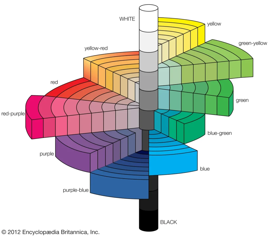
The Munsell system plots colors along a 3D tree based on three strict mathematical scales:
- Hue (The circle): The color family around the tree (Red, Yellow-Red, Yellow, Green-Yellow, Green, Blue-Green, Blue, Purple-Blue, Purple, Red-Purple).
- Value (The trunk): The vertical scale of lightness to darkness, running from 0 (pure black) at the bottom to 10 (pure white) at the top.
- Chroma (The branches): The horizontal distance extending outward from the neutral gray center, measuring purity or saturation (0 is completely gray/muted; 10 to 14+ is highly clear and vivid).
When applied to the 12 seasonal palettes, Munsell theory outlines the ideal mathematical boundaries for each sub-season’s wardrobe.
Sci\ART Color Space Diagnostic
Isolate your precise coordinate zone inside Albert Munsell’s 3D Color Tree using five integrated physical filtration scenarios.
Complete test vectors to populate the 3D Munsell coordinate space graph.
The 12 Sub-Seasons Mapped by Munsell Coordinates
1. The Deep Seasons (High Depth)
These palettes sit strictly on the lower half of the vertical Munsell trunk.
- Dark Winter:
- Hue: Cool/Neutral-Cool (leans Blue/Red-Purple).
- Value: Low to Medium-Low (2 to 4).
- Chroma: Medium-High. The colors are clear but anchored by heavy darkness.
- Dark Autumn:
- Hue: Warm/Neutral-Warm (leans Yellow-Red/Red).
- Value: Low to Medium-Low (2 to 4).
- Chroma: Medium. Rich, velvety, and deep, but tempered by earthy warmth.
2. The Light Seasons (Low Depth)
These palettes sit strictly on the upper portion of the vertical Munsell trunk. Heavy, low-value colors do not exist here.
- Light Summer:
- Hue: Cool/Neutral-Cool (leans Blue/Purple).
- Value: High (7 to 9).
- Chroma: Medium-Low. Delicate, watercolor pastels blended with a touch of gray.
- Light Spring:
- Hue: Warm/Neutral-Warm (leans Yellow/Yellow-Red).
- Value: High (7 to 9).
- Chroma: Medium-High. Airy, luminous, sunny pastels with zero heavy undertones.
3. The True Seasons (Absolute Hues)
These palettes occupy the extreme outer edges of the Hue circle. They represent pure temperature extremes with no boundary crossing.
- True Winter:
- Hue: Pure, Absolute Cool (Centred entirely on Blue).
- Value: Extreme contrast spanning the full trunk (pure 1 to pure 10).
- Chroma: High (8 to 12+). Completely clear, vivid, and icy.
- True Summer:
- Hue: Pure, Absolute Cool (Centred on Blue/Blue-Green).
- Value: Medium-High (5 to 7).
- Chroma: Low-Medium. Completely grayed-out, cool slate, and powder hues.
- True Spring:
- Hue: Pure, Absolute Warm (Centred entirely on Yellow/Yellow-Red).
- Value: Medium-High (6 to 8).
- Chroma: High (8 to 12). Vibrantly bright, golden, and radiant.
- True Autumn:
- Hue: Pure, Absolute Warm (Centred on Yellow-Red/Red).
- Value: Medium-Low (3 to 5).
- Chroma: Low-Medium. Purely earthy, heavily muted with brown and gold.
4. The Bright Seasons (High Saturation)
These palettes reach out to the furthest tips of the horizontal Munsell branches.
- Bright Winter:
- Hue: Cool/Neutral-Cool (leans Blue/Red-Purple).
- Value: High contrast, highly dynamic across the scale.
- Chroma: Maximum High (10 to 14+). Striking, electric, neon-adjacent clarity.
- Bright Spring:
- Hue: Warm/Neutral-Warm (leans Yellow/Yellow-Red).
- Value: Medium-High.
- Chroma: Maximum High (10 to 14). Sparkling, high-saturation tropical tones.
5. The Soft Seasons (Low Saturation)
These palettes cluster tightly around the vertical neutral gray trunk. They have the lowest chroma on the entire seasonal wheel.
- Soft Summer:
- Hue: Cool/Neutral-Cool (leans Blue/Green-Blue).
- Value: Medium (4 to 6).
- Chroma: Minimum Low (2 to 4). Muted, smoky, dusty, complex tones.
- Soft Autumn:
- Hue: Warm/Neutral-Warm (leans Yellow-Red/Yellow).
- Value: Medium (4 to 6).
- Chroma: Minimum Low (2 to 4). Soft, velvety tones mixed with olive, khaki, and sand.
Summarizing the Munsell Matrix
If you want to quickly cross-reference any palette using strict color science, look at how the dimensions interact:
| Munsell Dimension | Winter | Summer | Spring | Autumn |
| Hue (Undertone) | Cool | Cool | Warm | Warm |
| Value (Depth) | Dark / Stark Contrast | Light | Light | Dark |
| Chroma (Clarity) | Bright / Clear | Muted / Soft | Bright / Clear | Muted / Soft |
The Sci\ART Takeaway: An ideal palette under Munsell rules isn’t a collection of random favorite shades; it’s a harmonious ecosystem. Every color within a true 12-season palette shares a mathematical relationship along these axes, which is why they seamlessly coordinate when worn together.
To visualize the 12 seasons through the lens of strict Munsell Color Theory, we map them by their exact coordinates across the three scientific color axes: Hue (undertone temperature), Value (lightness vs. darkness), and Chroma (saturation vs. muteness).
Below is the complete 12-Season Munsell Matrix. It highlights the exact dominant parameter that defines each sub-season, showing how the boundaries fluidly connect into one another.
| Season | Sub-Season | Hue (Undertone) | Value (Depth) | Chroma (Clarity) | Dominant Munsell Trait |
| Winter | True Winter | Absolute Cool | High Contrast (Full Range) | High / Striking | Pure Cool Hue |
| Bright Winter | Cool / Neutral-Cool | Medium to High Contrast | Maximum / Vivid | Highest Chroma | |
| Dark Winter | Cool / Neutral-Cool | Low / Deep | Medium-High | Lowest Value | |
| Summer | True Summer | Absolute Cool | Medium-High | Low-Medium / Smoky | Pure Cool Hue |
| Light Summer | Cool / Neutral-Cool | High / Light | Medium-Low | Highest Value | |
| Soft Summer | Cool / Neutral-Cool | Medium | Minimum / Dusty | Lowest Chroma | |
| Autumn | True Autumn | Absolute Warm | Medium-Low | Low-Medium / Earthy | Pure Warm Hue |
| Dark Autumn | Warm / Neutral-Warm | Low / Deep | Medium | Lowest Value | |
| Soft Autumn | Warm / Neutral-Warm | Medium | Minimum / Velvety | Lowest Chroma | |
| Spring | True Spring | Absolute Warm | Medium-High | High / Radiant | Pure Warm Hue |
| Light Spring | Warm / Neutral-Warm | High / Light | Medium-High | Highest Value | |
| Bright Spring | Warm / Neutral-Warm | Medium-High | Maximum / Tropical | Highest Chroma |
Munsell 12-Season Matrix Explorer
Interactively map the dimensions of color space across the 12 sub-seasons
24 Season System Interactive Munsell Matrix
Expanding color season analysis to a 24-season system creates a highly fluid, ultra-precise spectrum. In a 24-season Munsell matrix, we map the 12 classic sub-seasons along with 12 distinct Midpoint / Transition Seasons that bridge the gaps between them.
This level of detail is ideal for individuals with highly neutral undertones or mixed contrast levels who feel standard palettes are a bit too extreme.
The 24-Season Blueprint
By mapping every step along the Munsell axes, the system transitions smoothly across the color space dimensions:
- Hue Flow: Sweeps continuously around the Munsell circle from absolute cool to neutral-cool, neutral-warm, and absolute warm.
- Value Blocks: Divided into distinct horizontal bands running from High (Light), Medium (Mid-tone), to Low (Deep).
- Chroma Rings: Concentrated close to the neutral center axis for Soft categories, stretching out to the absolute outer limits for Bright categories.
Munsell 24-Season Spectrum Explorer
Navigate the micro-transitions and midpoint zones of advanced color analysis
Conclusion: Mastering Your Palette Through Color Science
Understanding color analysis is more than just following a trend; it is about uncovering the mathematical harmony between your natural features and the color spectrum. By shifting your perspective from subjective “favorites” to the objective dimensions of Hue (Undertone), Value (Depth), and Chroma (Clarity), you transition from guesswork to a precise science.
Whether you identify with the crisp, icy clarity of a Winter or the earthy, velvet tones of an Autumn, your seasonal palette acts as a strategic toolkit. When you align your wardrobe and cosmetics with the Munsell coordinates that match your biological signature, you minimize the “noise” that distracts from your natural glow. Remember, while digital palettes are helpful starting points, they are often subject to screen calibration and artistic interpretation. The most reliable way to maintain your style is to prioritize the three traits of your season over exact shade matches. Ultimately, this system is designed to empower you: when you know exactly how light and color interact with your skin, you don’t just look like you’re wearing a color—the color works to elevate you.